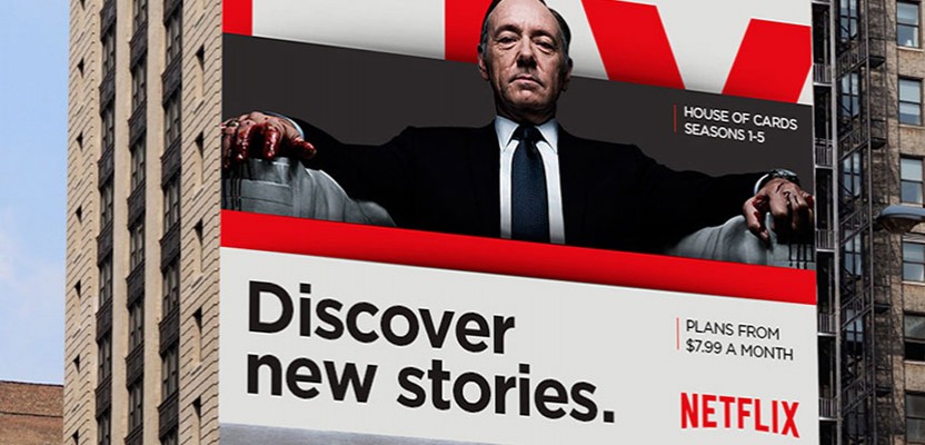

Gretel transform Netflix into a literal House of Cards
As maddeningly successful as it has become, few would argue that Netflix is long overdue for a visual upgrade. The internal design team unveiled a new, flatter logo design last year, which seemed at odds with the plain, black backgrounds, and as a result, many decried the logo as a tragic mis-step. It appears, however, that the logo redesign was just the first part of a complete design overhaul Netflix has engineered in tandem with creative studio Gretel, who released the fruits of this year-long collaboration earlier this week. The idea is to create a new brand identity for the video streaming service that posits it as a business capable of operating on a global scale.
Netflix has engineered a complete rebranding in tandem with creative studio Gretel, who released the fruits of this year-long collaboration earlier this week
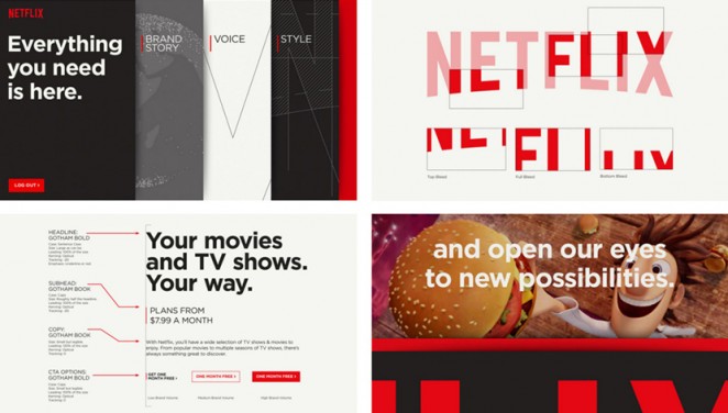
Gretel creative director Ryan Moore said of the bold rebranding effort: “The big challenge was unifying everything. They’re really successful, obviously, but the brand itself was a little fractured because they were working with partners and agencies around the word. They had the logo and some basic text guidelines, but due to the sheer growth, they couldn’t oversee digital, print, trailers, and social media. What they needed was an idea to stitch everything together (a conceptual approach) but certainly a visual system all these agencies could look at and adapt to any format they needed to.”
The Gretel team has developed a simple, flexible card system called “The Stack,” which is built up from three core components: Picture or video, text, and colour
The Gretel team has developed a simple, flexible card system called “The Stack,” which is built up from three core components (or “Cards”): The first is a photograph or video of a character from the show or movie in question, the second is a splash of colour (generally white or red), and the third is text of some sort (be it a movie title or tagline). Together, these three cards stacked together, form the basis of the new Netflix branding. It works surprisingly well. Not only is the stack instantly recognisable at various scales and mediums (so it looks as at home on a gigantic billboard as it does as a banner on a website), but is infinitely tweak-able. It also looks like it's been built to function as a more immediate and visually appealing UI, which will feel as at home on an iPhone as it does on a PS4. It all looks very promising and incredibly cohesive.
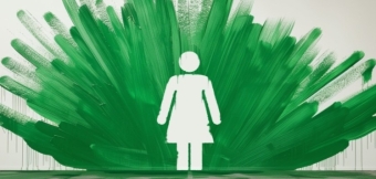
Sharing Economy rebrand is playful and Supple
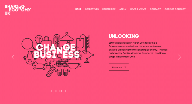
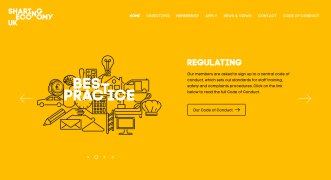
Sharing Economy UK, the trade body for peer-to-peer companies such as AirBnB and ZipCar, has been given a colourful rebrand by Supple Studio, which focuses on the idea of sharing, tapping not only into the company moniker, but its identity as a P2P business. SEUK was founded in 2014 and was set up to promote the domestic sector and best practice. Supple was briefed to create a vibrant identity for the platform that feels established and authoritative. The branding is based around a set of icons, which have been created to show-off the range of services offered by SEUK affiliated companies, with each company summed up in a simple visual icon.
Sharing Economy UK has been given a colourful rebrand by Supple Studio
Supple Studio creative director Jamie Ellul, said: “We wanted to create a simple unobtrusive logo that got across sharing in a quick and memorable way. When we hit on the idea of the two words ‘sharing’ a letterform it felt very natural and got across the concept of sharing resources very succinctly. We drew the icons in a very economical way, they all share angles which allows them to be locked up together in a variety of ways to suggest the sector joining forces. These lockups then form a background for the brand.” As well as the design work from Supple, Jim Davies of Totalcontent has worked on copy and tone of voice for the company, and a new website has been designed and built by Mud.
Cathay Pacific unveils rebranded fleet of aircraft
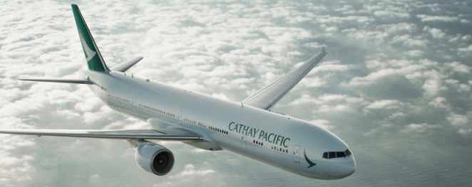
Hong Kong airline Cathay Pacific is launching a new livery design for its aircraft, part of an exhaustive rebrand and design shift that began last year. The new livery launches this week and is being applied to all the aircraft in the Cathay Pacific fleet, with the new “Brushwing” identity, which was designed by the Hong Kong-based Eight Partnership and initially launched in October 2014, sitting at the centre of everything. The rebrand also sees the colour palette streamlined to a more refined green, grey and white, whilst the Cathay Pacific name and identity is also displayed more prominently. The livery has also been designed by Eight Partnership, which worked on the project for six months with the airline's engineering team.
Cathay Pacific is launching a new livery design for its aircraft, part of an exhaustive rebrand and design shift that began last year
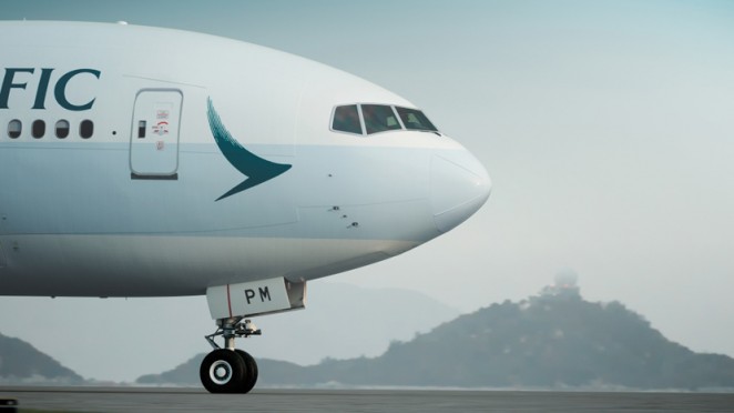
Eight Partnership creative director Iain Richardson, said: “While the changes may seem subtle, they have been very carefully considered. In fact, thousands of variations on the plane’s fuselage, tail, word-mark and wing tips were contemplated. While the design changes may appear discreet, this livery refresh strongly embraces the airline’s core design values, while at the same time bringing a sense of elegant modernity.” Cathay Pacific chief executive Ivan Chu added: “Creating a new livery is much more than a cosmetic exercise. This new look is the latest (and most significant) development in our ongoing efforts to improve the overall customer experience at Cathay Pacific.”

The new livery includes the new “Brushwing” identity, and was designed by the Hong Kong-based Eight Partnership
As well as introducing a new livery, the airline also updating its website and mobile app and redesigning its lounges at Hong Kong, Tokyo, Manila, Bangkok and beyond. It's also introducing a new Airbus A350 fleet, and further expanding its network. The new Airbus A350 series will be the first fleet to launch with the new livery and the airline’s existing fleet will be repainted with the new livery as aircraft go through their normal maintenance schedule over the next five years, with some 150 aircraft getting the new look in total.